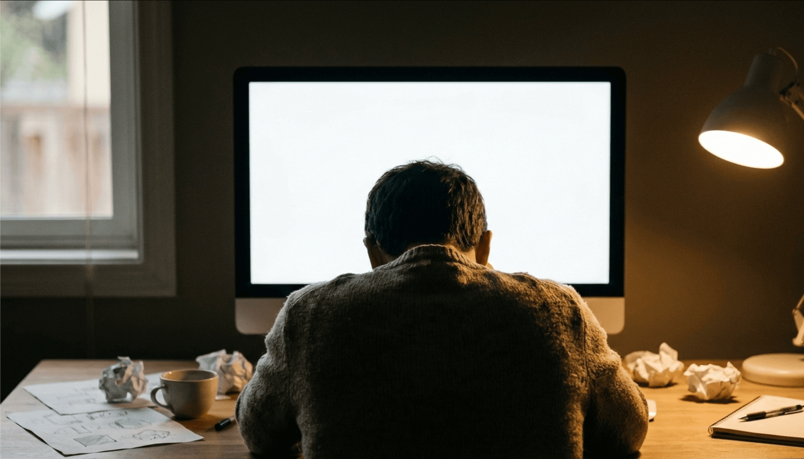
Every designer knows the feeling. A new project lands. You open your tool. A blank canvas stares back at you.
What follows is not a burst of creativity. It is a slow, grinding process of setting up guides, choosing a grid, experimenting with type scales, trying three different layout arrangements, adjusting spacing pixel by pixel, aligning elements to each other, and then scrapping it all because none of it feels right.
By the time you start doing the actual creative work, the interesting part where ideas become visual, an hour has already passed. Often more.
The 60% Problem
Here is a number that should bother every designer: roughly 60% of design time is spent on mechanical tasks rather than creative expression.
This includes:
- Setting up the document - artboard sizes, grid systems, margins
- Initial layout exploration - trying different arrangements of the same elements
- Alignment and spacing - getting elements to line up, maintaining consistent gaps
- Typography setup - choosing fonts, setting scale, testing readability
- Color exploration - testing palette combinations against actual content
- Consistency checks - making sure repeated elements match across the design
These tasks are necessary. A design with poor alignment and inconsistent spacing looks amateur regardless of how creative the concept is. But they are not where designers add unique value.
The creative work, the part that requires taste, judgment, and original thinking, is what fills the remaining 40%. Conceptual exploration. Visual metaphors. Hierarchy decisions. The details that make someone pause and actually look at a design instead of scrolling past it.
Why the Blank Canvas Is the Worst Starting Point
The blank canvas seems like it should be liberating. Total freedom. No constraints. Infinite possibilities.
In practice, it is paralyzing.
Too many choices, too early. Before you can explore creative ideas, you need to make dozens of structural decisions. What size? What grid? Where does the text go? How large? What font? These decisions are necessary but they are not creative decisions in any meaningful sense. They are scaffolding.
No momentum. Starting from nothing requires enormous activation energy. Every designer has experienced staring at a blank artboard for fifteen minutes before placing the first element. Contrast this with editing an existing design, which feels effortless because the context and constraints are already established.
Premature commitment. Once you place the first few elements on a blank canvas, you tend to build around them even if the initial placement was arbitrary. The first layout you try becomes an anchor that biases all subsequent decisions. Designers rarely scrap their initial layout and start over, even when they should.
Repetitive setup. Most of the blank canvas work is identical across projects. Setting up grids, choosing type scales, establishing spacing systems: these tasks repeat with minor variations every single time you start a new project.
What Freelancers and In-House Designers Both Feel
This problem hits differently depending on your role, but it hits everyone.
Freelance designers feel it as a direct hit to their income. Time spent on layout scaffolding is time they cannot bill at their creative rate. Clients are paying for the final design, not for the hours spent getting alignment right. Every blank canvas eats into margins.
Freelancers also face the iteration problem. Clients see a first draft and request changes. Each round of revisions triggers another cycle of mechanical adjustments: moving elements, re-aligning, checking spacing. Three rounds of revisions can mean more time on layout adjustments than was spent on the original creative concept.
In-house designers feel it as throughput pressure. Marketing needs campaign assets for three platforms by Friday. Product needs updated screenshots for the new feature. Sales needs a one-pager for a pitch tomorrow. The blank canvas multiplies across every request, and there are never enough hours.
In-house designers also face the consistency challenge. When you are producing dozens of assets per month, maintaining visual consistency across all of them while starting each one from a blank canvas is exhausting. Small inconsistencies creep in. Spacing drifts. Font sizes vary by a point or two. The brand starts to feel slightly off without anyone being able to pinpoint exactly why.
What Has Been Tried (And Why It Falls Short)
Design systems and component libraries. These help with consistency but do not solve the layout problem. You still face a blank canvas. You just have pre-built pieces to place on it. The mechanical work of arrangement, spacing, and alignment remains.
Templates. These eliminate the blank canvas but replace it with a different problem: generic output. We covered this in depth in another post, but the short version is that templates trade uniqueness for speed. For many designers, that is not an acceptable trade.
AI image generators. These skip the entire design process, which means they skip the creative control too. You get a finished image but you cannot adjust the typography, change the layout structure, or refine individual elements. It is all or nothing.
Figma auto-layout and smart features. These reduce some mechanical work within an existing layout but do not help with the initial layout decision. You still stare at a blank canvas. The alignment is faster once you start, but starting is still the hardest part.
The Real Solution: AI That Handles Scaffolding, Not Creativity
The blank canvas problem is actually two problems combined:
- The scaffolding problem - setting up structure, grid, type scale, spacing
- The direction problem - choosing a layout concept to explore
Both problems can be solved without sacrificing creative control. The key insight is that these problems are mechanical, not creative. They have good solutions and bad solutions, but the good solutions are fairly predictable based on the content and context.
If AI can read your content and understand that you are making a poster for a tech conference, it can generate sensible layout directions: a bold typographic approach, a modular grid layout, an asymmetric editorial style. These are starting directions, not finished designs.
You choose the direction that resonates. Then you edit. Every layer, every element, every pixel is under your control. But you never had to stare at a blank canvas. You never had to spend thirty minutes on grid setup. You started with context and intent, and the AI did the scaffolding.
This is the approach Lega takes. You describe what the design is about, and the AI generates layout directions and style systems based on your content. You pick a direction and have full creative control from there. The blank canvas is replaced by a contextual starting point.
Practical Tips for Right Now
Even without changing tools, you can reduce blank canvas time:
Write a brief before opening your design tool. Spend five minutes writing down: what is this design about, who will see it, what is the single most important thing to communicate, and what is the format. This mental scaffolding reduces the paralysis of infinite choice.
Build personal starter files. Create document templates with your preferred grids, type scales, and spacing systems already configured. Not design templates, just structural scaffolding you reuse across projects.
Start with content, not layout. Place your actual content, the headline, the body text, the key image, on the canvas before you start arranging anything. Let the content inform the layout instead of fitting content into a pre-decided structure.
Set a five-minute layout limit. Give yourself five minutes to choose a basic layout direction. Place the major elements in rough positions and commit. You can always adjust later, but committing early prevents the hours-long layout exploration loop.
Design in passes. First pass: rough placement. Second pass: alignment and spacing. Third pass: typography and color. Fourth pass: detail and polish. Separating these concerns reduces the cognitive load at each stage.
Reclaiming the 60%
The mechanical parts of design are necessary but they should not dominate your time. The future of design tools is about reclaiming that 60% and redirecting it toward the work that actually requires human creativity.
Imagine starting every project with a contextual, content-aware starting point instead of a blank canvas. Imagine spending 80% of your time on creative decisions and 20% on refinement. That is the productivity shift that content-first, AI-assisted design makes possible.
The blank canvas had its era. It is time for design tools that understand what you are making and help you get to the creative work faster.
Your best creative work happens when you are making design decisions, not measuring spacing. Start with your content and intent, and let intelligent tools handle the scaffolding.